visual identity, website, icons, motion graphics
SMELT
SMELT is a social design / design research studio based in Rotterdam. By taking to the streets and creating objects, installations and interventions, SMELT 'creates space for conversation'. Their approach allows them to dive into complex and/or taboo topics such as drugs, intimidation or intimacy, in a safe and inclusive way in which everyone is allowed to have a say.
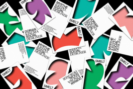
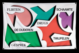
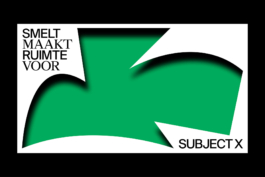
The visual identity we created grows from this idea that SMELT is able to create a space for any subject. A space that can have any form and size, and which is elastic and adaptable. The identity captures SMELT's energetic and daring approach, which uses actual physical space in unexpected ways. Next to this, the visual identity positions SMELT in the verge between art and design, and as a distinctive studio with a strong voice.
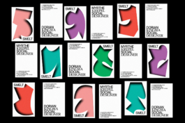
We designed a range of standard visual identity items such as posters and business cards, which can turn into animated versions to be used online or during presentations. Each item has the possibility to have a unique 'space' visual on it, in a way that no item is like any other, even if they are very similar.
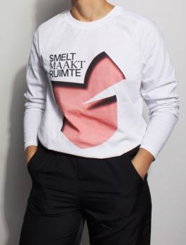
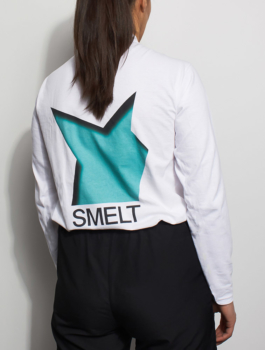
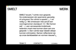
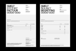
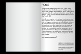
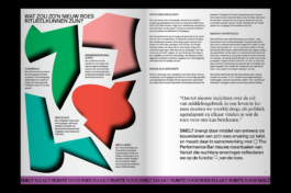
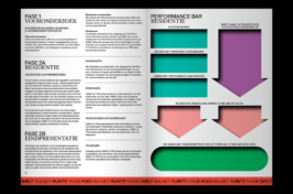
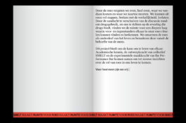
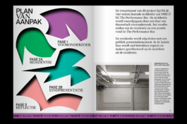
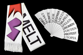
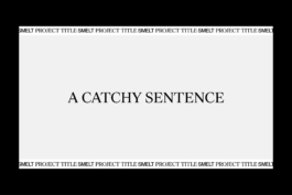
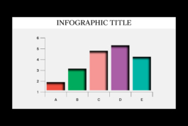
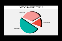
The visual identity combines colorful, bold and expressive space shapes with very sober, black and white layouts and typographic treatments. This way, wildness and sobriety become interdependent in order to ensure harmonious visual outcomes. This contrasted combination is clearly present in items such as SMELT's website, merch, editorial publications or presentation slides.


Concept, design and creative direction: What The Studio

visual identity, website, icons, motion graphics
SMELT
SMELT is a social design / design research studio based in Rotterdam. By taking to the streets and creating objects, installations and interventions, SMELT 'creates space for conversation'. Their approach allows them to dive into complex and/or taboo topics such as drugs, intimidation or intimacy, in a safe and inclusive way in which everyone is allowed to have a say.
The visual identity we created grows from this idea that SMELT is able to create a space for any subject. A space that can have any form and size, and which is elastic and adaptable. The identity captures SMELT's energetic and daring approach, which uses actual physical space in unexpected ways. Next to this, the visual identity positions SMELT in the verge between art and design, and as a distinctive studio with a strong voice.


We designed a range of standard visual identity items such as posters and business cards, which can turn into animated versions to be used online or during presentations. Each item has the possibility to have a unique 'space' visual on it, in a way that no item is like any other, even if they are very similar.


The visual identity combines colorful, bold and expressive space shapes with very sober, black and white layouts and typographic treatments. This way, wildness and sobriety become interdependent in order to ensure harmonious visual outcomes. This contrasted combination is clearly present in items such as SMELT's website, merch, editorial publications or presentation slides.


Concept, design and creative direction: What The Studio
Wouldn't it be nice to work together?
Talk to us: hello@what-the.studio
CONTACT
hello@what-the.studio
+31 646425297
Hey, visitor!
We are What The Studio, an independent graphic design & creative direction studio in Amsterdam.