visual identity, packaging, ILLUSTRATION, infographics, motion graphics, website, graphic design
Selfkit
Selfkit is a self-testing kit and laboratory analysis service for the detection of sexually transmitted diseases and infections (STDs / STIs). Selfkit offers a convenient, fast, and accessible way for everyone to keep regular control over their sexual health.
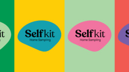
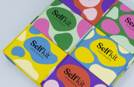
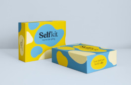
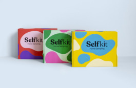
The visual identity we have created for Selfkit aims to eliminate the fear and taboos surrounding sexual health. The shapes or "blobs" that are iconic of this identity are abstract representations of various STIs viewed through a microscope. Rather than turning a blind eye, confronting an STI diagnosis is a sign of empowerment and the first step towards health and peace of mind. This identity not only acknowledges potential illnesses head-on but does so with a sense of acceptance and optimism.





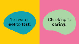
The tone of voice is also a crucial part of Selfkit’s identity. With humor, lightness, and the warmth of a close friend, Selfkit motivates and educates individuals to be in charge of their sexual health.



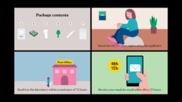
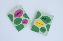
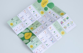
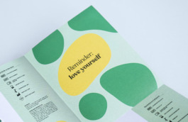
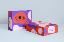
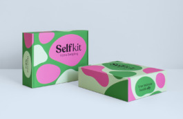
The visual identity is reflected across various applications: product packaging featuring diverse shapes and colors that identify different types of self-tests; user instructions available in both printed and animated video formats; an icon system representing all kit elements, product benefits, customer journey, and online purchasing process; campaign imagery; webshop design concept; and infographics about various STIs and their detection processes.
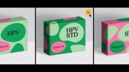


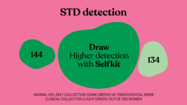
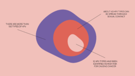
In summary, Selfkit's visual identity breaks away from the traditional sterile aesthetic of pharmaceutical products, opting instead for an approachable, comfortable, and friendly experience for consumers. It maintains essential values like safety, professionalism, and credibility that are critical for health-related products and services.

Design and creative direction: What The Studio
Motion design: Sergio Tomasa and Ubalio Martínez

visual identity, packaging, ILLUSTRATION, infographics, motion graphics, website, graphic design
Selfkit
Selfkit is a self-testing kit and laboratory analysis service for the detection of sexually transmitted diseases and infections (STDs / STIs). Selfkit offers a convenient, fast, and accessible way for everyone to keep regular control over their sexual health.

The visual identity we have created for Selfkit aims to eliminate the fear and taboos surrounding sexual health. The shapes or "blobs" that are iconic of this identity are abstract representations of various STIs viewed through a microscope. Rather than turning a blind eye, confronting an STI diagnosis is a sign of empowerment and the first step towards health and peace of mind. This identity not only acknowledges potential illnesses head-on but does so with a sense of acceptance and optimism.


The tone of voice is also a crucial part of Selfkit’s identity. With humor, lightness, and the warmth of a close friend, Selfkit motivates and educates individuals to be in charge of their sexual health.


The visual identity is reflected across various applications: product packaging featuring diverse shapes and colors that identify different types of self-tests; user instructions available in both printed and animated video formats; an icon system representing all kit elements, product benefits, customer journey, and online purchasing process; campaign imagery; webshop design concept; and infographics about various STIs and their detection processes.


In summary, Selfkit's visual identity breaks away from the traditional sterile aesthetic of pharmaceutical products, opting instead for an approachable, comfortable, and friendly experience for consumers. It maintains essential values like safety, professionalism, and credibility that are critical for health-related products and services.

Design and creative direction: What The Studio
Motion design: Sergio Tomasa and Ubalio Martínez
Wouldn't it be nice to work together?
Talk to us: hello@what-the.studio
CONTACT
hello@what-the.studio
+31 646425297
Hey, visitor!
We are What The Studio, an independent graphic design & creative direction studio in Amsterdam.