campaign, visual identity, photography
Nederlands Theater Festival 2019
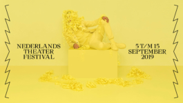
Nederlands Theater Festival (NTF) yearly brings together the best of Dutch and Flemish Theater. We created and developed the concept for the communication campaign across diverse media, such as a city and social media campaign, brochures, magazines, theater dressing, screens, and the re-design of a brand new website.
While following up the visual identity we created and introduced in the previous edition of the Festival, this year's communication campaign aims to call a more diverse audience to celebrate theater. At the same time, the campaign brings the 'Gala van het Nederlands Theater' to the front with a 'European' kind of glamour, being this Gala the climax of the theater festival and the moment in which the best performances of the year are awarded.
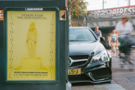
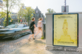
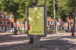
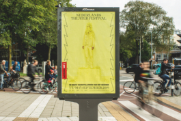
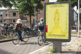
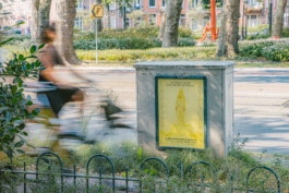
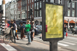
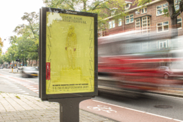
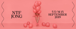
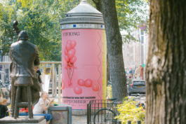
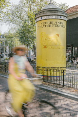
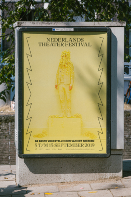
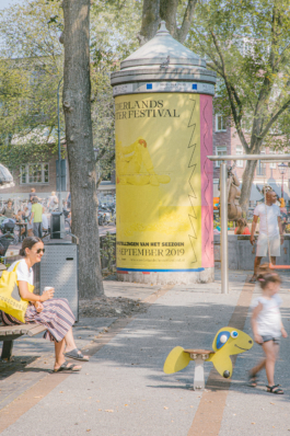
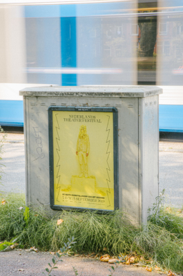
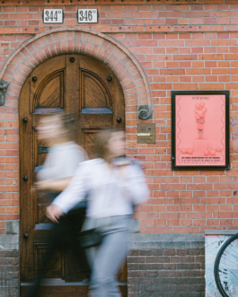
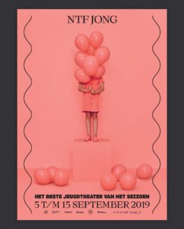
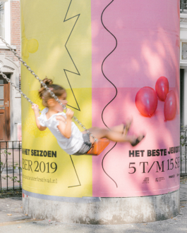
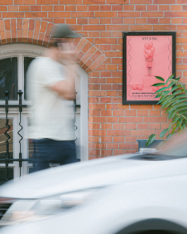
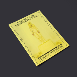
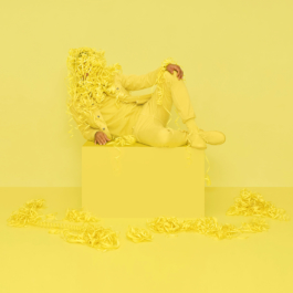
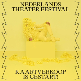
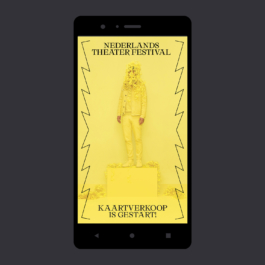
We produced two photographic campaign images, making a distinction between the two main lines of the festival: the general programme (mainly targeted to adult audiences) on one hand, and NTF Jong (the programme specifically targeted to children/youth audiences) on the other. Use of color was key to clearly distinguish the different lines of the program. The campaign was widely spread across the city of Amsterdam, with posters printed in various formats.
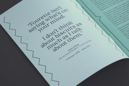
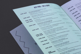
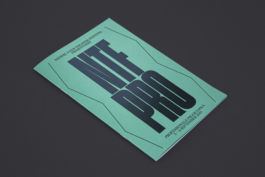
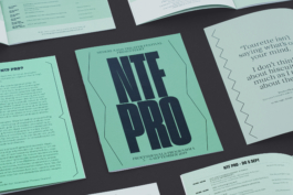
In 2019, Nederlands Theater Festival introduced a new section to its programme, specially dedicated to professionals working on the theater industry. We created the sub-brand 'NTF PRO', and gave it a specific color and typographic treatment, which was later applied to different print and digital media.
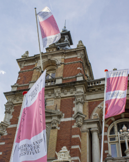

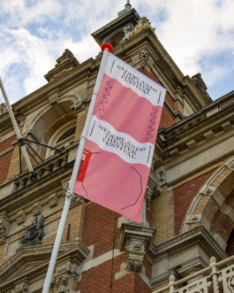
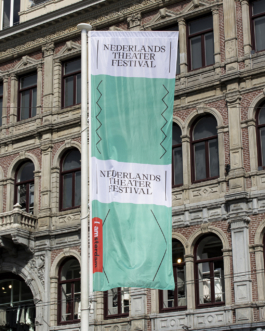
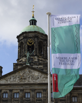
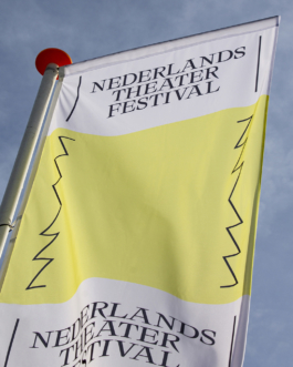
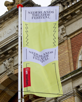
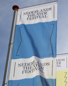
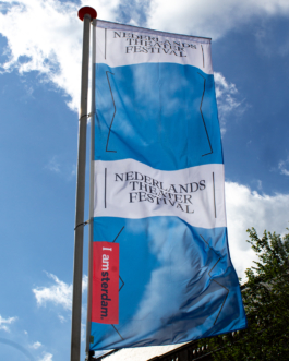

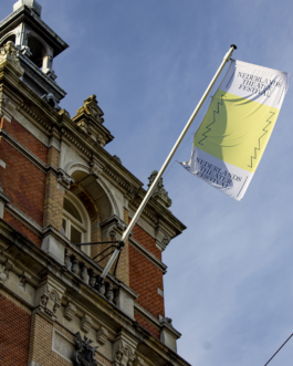
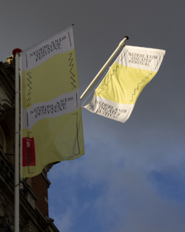
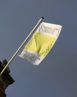
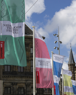
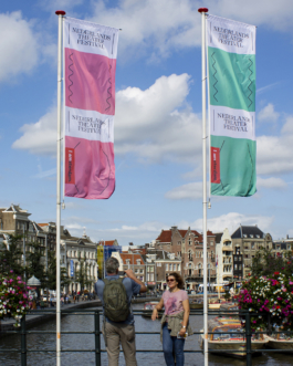
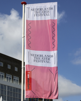

We also printed a good amount of colorful flags -according to the new color-coded way to communicate the program-, which were placed around Amsterdam's city centre, festively announcing the start and eleven-day presence of the festival in town.
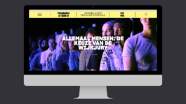
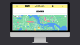
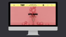
It was time for NTF to have a fresh new website, which we redesigned turning it from a mainly informational site into a 'sales first' one, through a very visual and accessible way of browsing the programme and buying tickets, and improving the mobile version. We gave performance and long-read pages a more editorial treatment, presenting content with the relevance it deserves, enhancing the beautiful theater imagery, and easing the readers' experience in the more in-depth pages.
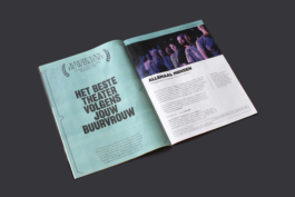
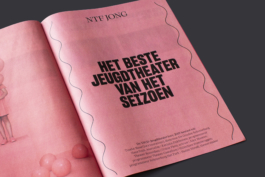
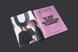
NTF has a wide program that needs to be communicated across diverse channels. We produced a printed program brochure with a newspaper press, and spiced up its informational function by creating some humorous descriptions of the different parts of the program, such as 'The best theater according to your neighbour'.
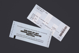
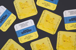
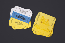
Other printed items, such as beermats and entrance tickets to the performances, were produced not just for promotional purposes but also as part of the venue dressing during the festival.
NTF's programme revolves around the Official Jury Selection. This selection gathers the best theater performances of the year, which can be seen -often for the last time- during the festival. Every year, we create a video to announce the chosen performances, being its release an exciting and festive moment for the Dutch theater industry. This years' animation is one of the few communication items in which the color palette of NTF is fully displayed.
Creative direction and design: What The Studio
Campaign photography: Benning & Gladkova
Web development: Floris Douma
Officiële Juryselectie animation: Simon François

Nederlands Theater Festival 2019
Nederlands Theater Festival (NTF) yearly brings together the best of Dutch and Flemish Theater. We created and developed the concept for the communication campaign across diverse media, such as a city and social media campaign, brochures, magazines, theater dressing, screens, and the re-design of a brand new website.
While following up the visual identity we created and introduced in the previous edition of the Festival, this year's communication campaign aims to call a more diverse audience to celebrate theater. At the same time, the campaign brings the 'Gala van het Nederlands Theater' to the front with a 'European' kind of glamour, being this Gala the climax of the theater festival and the moment in which the best performances of the year are awarded.

We produced two photographic campaign images, making a distinction between the two main lines of the festival: the general programme (mainly targeted to adult audiences) on one hand, and NTF Jong (the programme specifically targeted to children/youth audiences) on the other. Use of color was key to clearly distinguish the different lines of the program. The campaign was widely spread across the city of Amsterdam, with posters printed in various formats.


In 2019, Nederlands Theater Festival introduced a new section to its programme, specially dedicated to professionals working on the theater industry. We created the sub-brand 'NTF PRO', and gave it a specific color and typographic treatment, which was later applied to different print and digital media.


We also printed a good amount of colorful flags -according to the new color-coded way to communicate the program-, which were placed around Amsterdam's city centre, festively announcing the start and eleven-day presence of the festival in town.


It was time for NTF to have a fresh new website, which we redesigned turning it from a mainly informational site into a 'sales first' one, through a very visual and accessible way of browsing the programme and buying tickets, and improving the mobile version. We gave performance and long-read pages a more editorial treatment, presenting content with the relevance it deserves, enhancing the beautiful theater imagery, and easing the readers' experience in the more in-depth pages.


NTF has a wide program that needs to be communicated across diverse channels. We produced a printed program brochure with a newspaper press, and spiced up its informational function by creating some humorous descriptions of the different parts of the program, such as 'The best theater according to your neighbour'.


NTF's programme revolves around the Official Jury Selection. This selection gathers the best theater performances of the year, which can be seen -often for the last time- during the festival. Every year, we create a video to announce the chosen performances, being its release an exciting and festive moment for the Dutch theater industry. This years' animation is one of the few communication items in which the color palette of NTF is fully displayed.
Creative direction and design: What The Studio
Campaign photography: Benning & Gladkova
Web development: Floris Douma
Officiële Juryselectie animation: Simon François
Wouldn't it be nice to work together?
Talk to us: hello@what-the.studio
CONTACT
hello@what-the.studio
+31 646425297
Hey, visitor!
We are What The Studio, an independent graphic design & creative direction studio in Amsterdam.