campaign, photography
Imagine Film Festival
Imagine Film Festival is the horror and fantasy festival in The Netherlands. With a long history (the festival started in the 80’s) and a loyal audience, Imagine welcomes genre fans, professionals, students, and anyone who is interested in terror, sci-fi, AI, AR, and other parallel worlds.
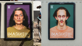
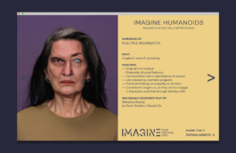
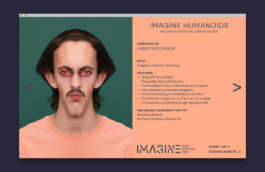
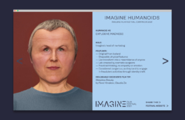
For the festival campaign in 2021 we envisioned an engaging series of humanoids: real looking people with a disturbing twist.

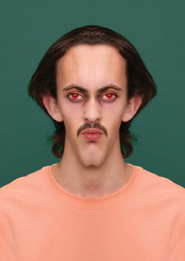
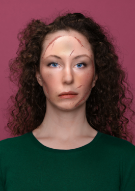

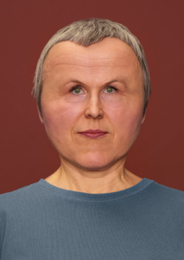
The humanoids would provide their tips on the festival program, and surprise potential visitors by launching a new campaign image every few days.
The look and feel of the campaign images deliberately avoids falling into the clichés of the horror genre. No blood, no ghosts or people screaming. Instead, clean and bold photography, a dark and strong color palette, and a subtle twist to convey the message.


Next to this, we updated the visual identity of Imagine, making its iconic stencil logo more flexible and ‘techy’, while keeping the original concept behind it: ‘fill in the gaps with your imagination’.
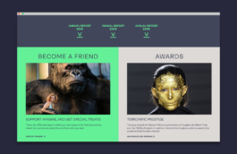
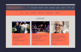
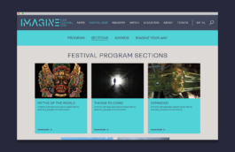
We designed a new website for Imagine where the updated visual identity appears on full display. Its structure is thought to turn a content-heavy website into a light and accessible one. A range of modules has been designed to display diverse types of content, providing the client with freedom to compose the structure of each page according to their needs.



Visual identity and website restyle: What The Studio
Campaign concept and design: What The Studio
Campaign photography: Benning & Gladkova, What The Studio

Imagine Film Festival
Imagine Film Festival is the horror and fantasy festival in The Netherlands. With a long history (the festival started in the 80’s) and a loyal audience, Imagine welcomes genre fans, professionals, students, and anyone who is interested in terror, sci-fi, AI, AR, and other parallel worlds.
For the festival campaign in 2021 we envisioned an engaging series of humanoids: real looking people with a disturbing twist.


The humanoids would provide their tips on the festival program, and surprise potential visitors by launching a new campaign image every few days.
The look and feel of the campaign images deliberately avoids falling into the clichés of the horror genre. No blood, no ghosts or people screaming. Instead, clean and bold photography, a dark and strong color palette, and a subtle twist to convey the message.


Next to this, we updated the visual identity of Imagine, making its iconic stencil logo more flexible and ‘techy’, while keeping the original concept behind it: ‘fill in the gaps with your imagination’.
We designed a new website for Imagine where the updated visual identity appears on full display. Its structure is thought to turn a content-heavy website into a light and accessible one. A range of modules has been designed to display diverse types of content, providing the client with freedom to compose the structure of each page according to their needs.


Visual identity and website restyle: What The Studio
Campaign concept and design: What The Studio
Campaign photography: Benning & Gladkova, What The Studio
Wouldn't it be nice to work together?
Talk to us: hello@what-the.studio
CONTACT
hello@what-the.studio
+31 646425297
Hey, visitor!
We are What The Studio, an independent graphic design & creative direction studio in Amsterdam.