visual identity, graphic design
ARWE Gallery
ARWE GALLERY is an art space in Gouda (The Netherlands), showcasing an eclectic range of work from established to up-and-coming artists. In a dynamic program of regular exhibitions, ARWE GALLERY is a place of reference for new art trends, a must-go for collectors, and a bridge between artists and bigger galleries and art institutions.
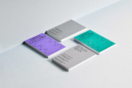
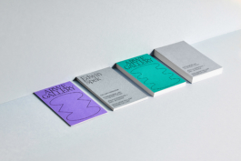
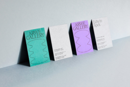
ARWE GALLERY’s new visual identity is slick and minimalistic, yet playful, providing the gallery with a high-end but not exclusive profile; it also breathes the looseness and friendliness of a space that is constantly on the look for presenting fresh art.
The visual identity features and endless range of ‘elastic podiums’ sustaining ARWE GALLERY’s logo-word as well as other communication contents, in reference to the gallery’s role with providing artists with visibility and catapulting them towards a next big step on their careers.
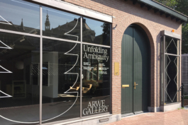
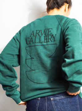
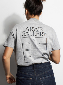
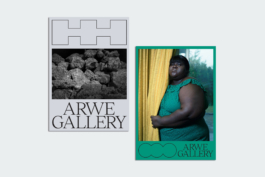
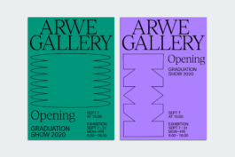
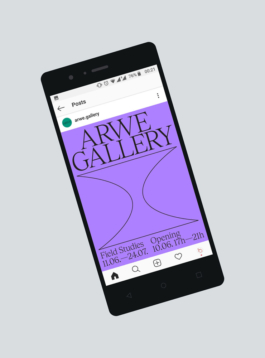
This visual identity recipe doesn’t have too many ingredients, but it’s all about combining them in the right measure: an unusual color palette (silver/grey, purple, green, black), a bunch of thin outlined shapes, and a combination of two elegant serif and sans-serif typefaces.
Concept, design and creative direction: What The Studio

visual identity, graphic design
ARWE Gallery
ARWE GALLERY is an art space in Gouda (The Netherlands), showcasing an eclectic range of work from established to up-and-coming artists. In a dynamic program of regular exhibitions, ARWE GALLERY is a place of reference for new art trends, a must-go for collectors, and a bridge between artists and bigger galleries and art institutions.
ARWE GALLERY’s new visual identity is slick and minimalistic, yet playful, providing the gallery with a high-end but not exclusive profile; it also breathes the looseness and friendliness of a space that is constantly on the look for presenting fresh art.
The visual identity features and endless range of ‘elastic podiums’ sustaining ARWE GALLERY’s logo-word as well as other communication contents, in reference to the gallery’s role with providing artists with visibility and catapulting them towards a next big step on their careers.


This visual identity recipe doesn’t have too many ingredients, but it’s all about combining them in the right measure: an unusual color palette (silver/grey, purple, green, black), a bunch of thin outlined shapes, and a combination of two elegant serif and sans-serif typefaces.
Concept, design and creative direction: What The Studio
Wouldn't it be nice to work together?
Talk to us: hello@what-the.studio
CONTACT
hello@what-the.studio
+31 646425297
Hey, visitor!
We are What The Studio, an independent graphic design & creative direction studio in Amsterdam.