visual identity, website, infographics, graphic design
Art-up
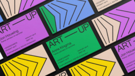
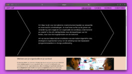
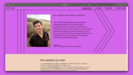
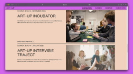
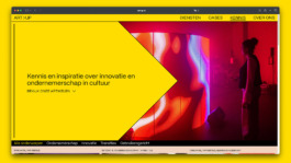
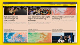
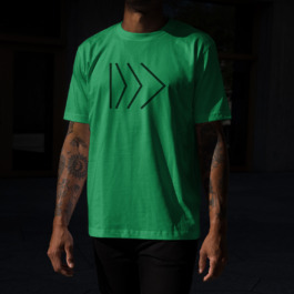
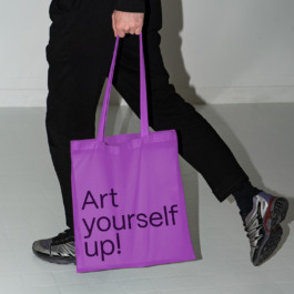
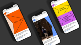
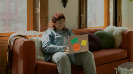
Art-up provides custom-made educational services to organizations in the cultural sector. Through training and advice, Art-up helps clients achieve their goals while remaining committed to positive, future-proof transformation. Art-up’s new visual identity centers around the concept of "On the Way to the Future," visually expressing the customization and flexibility that are central to Art-up’s work. The core visual element—a forward-pointing arrow—repeats, contracts, and expands, symbolizing the various steps and pace of the learning process, which is unique to each client. This approach to visually representing Art-up’s mission results in a flexible visual identity that can continuously evolve while remaining coherent and recognizable across all contexts.
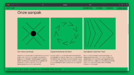
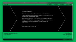


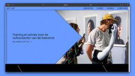
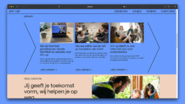
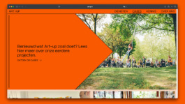
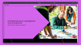
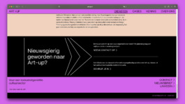
For the website, the primary goal was to present content as clearly as possible while allowing space for the brand’s iconic and playful elements. While much of the content from the previous website was retained, we collaborated with the Art-up team to develop a new content structure that enables potential clients to easily understand what Art-up offers. Our main role was to reorganize and simplify the structure and navigation to avoid repetition and content overlap, while also bringing the new visual identity to life. Additionally, it was important to create a sense of hierarchy and lightness within more complex or lengthy pages, enhancing readability and maintaining a balance between form and function.




Design and creative direction: What The Studio
Web development: Yannick Gregoire
Motion design: Sergio Tomasa

visual identity, website, infographics, graphic design
Art-up
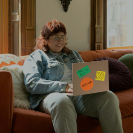
Art-up provides custom-made educational services to organizations in the cultural sector. Through training and advice, Art-up helps clients achieve their goals while remaining committed to positive, future-proof transformation. Art-up’s new visual identity centers around the concept of "On the Way to the Future," visually expressing the customization and flexibility that are central to Art-up’s work. The core visual element—a forward-pointing arrow—repeats, contracts, and expands, symbolizing the various steps and pace of the learning process, which is unique to each client. This approach to visually representing Art-up’s mission results in a flexible visual identity that can continuously evolve while remaining coherent and recognizable across all contexts.


For the website, the primary goal was to present content as clearly as possible while allowing space for the brand’s iconic and playful elements. While much of the content from the previous website was retained, we collaborated with the Art-up team to develop a new content structure that enables potential clients to easily understand what Art-up offers. Our main role was to reorganize and simplify the structure and navigation to avoid repetition and content overlap, while also bringing the new visual identity to life. Additionally, it was important to create a sense of hierarchy and lightness within more complex or lengthy pages, enhancing readability and maintaining a balance between form and function.


Design and creative direction: What The Studio
Web development: Yannick Gregoire
Motion design: Sergio Tomasa
Wouldn't it be nice to work together?
Talk to us: hello@what-the.studio
CONTACT
hello@what-the.studio
+31 646425297
Hey, visitor!
We are What The Studio, an independent graphic design & creative direction studio in Amsterdam.