campaign, visual identity, photography
Amsterdam Spanish Film Festival 2019
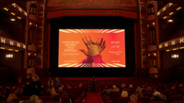
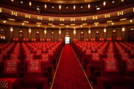
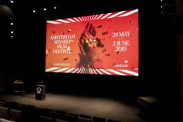
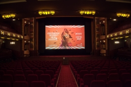
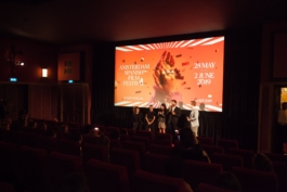
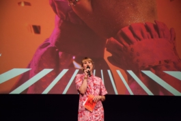
Following up with the flexible visual identity we created for the festival in 2018 – visualizing Spanish sunlight coming out from a cinema screen – we are introducing an update to the identity for this 5th edition of the festival: the 'Canela' typeface. The new typeface expresses the warmth and elegance of the festival, which has Pathé Tuschinski as a main venue. In an ambiguous space between serif and sans, it communicates the long standing tradition of Spanish cinema as well as the modernity of the carefully curated film selection of the festival.
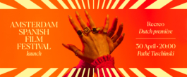
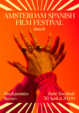
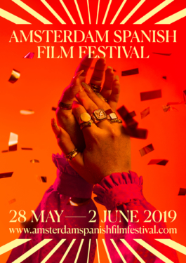
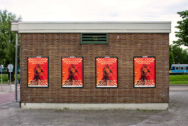
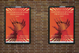
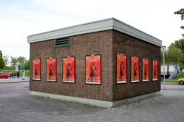
The campaign image is a celebratory applause, and a humorous portrait of Spanish clichés. It also evokes the atmosphere of the cinema theaters during this 5th anniversary of the festival, while introducing one of the recurring themes in the films and side events of this edition: flamenco.
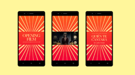
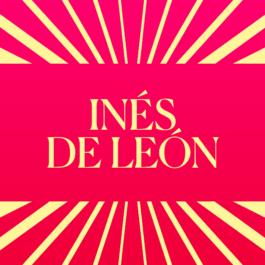
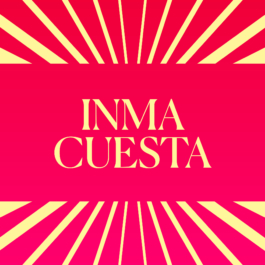
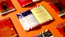
As in every new edition of the film festival, the city poster campaign is accompanied with a social media campaign which is strongly supported by the the festival's visual identity: the 'Canela' typeface in combination with the flexible visual system that allows create a sense of newness for each publication – combining different stroke widths with different color gradient shades every time.
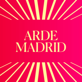
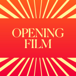
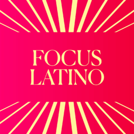
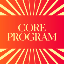
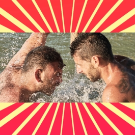
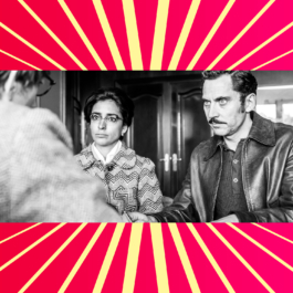
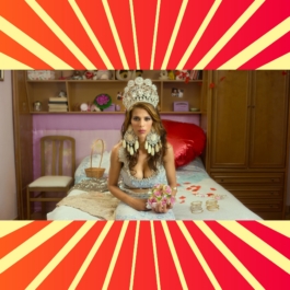
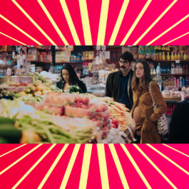
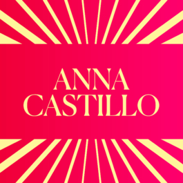
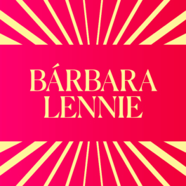
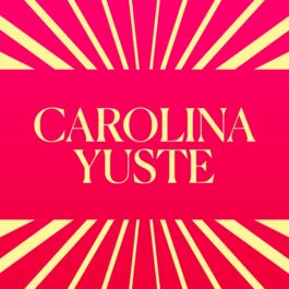
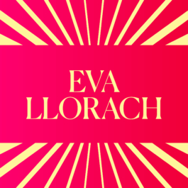
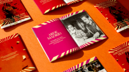
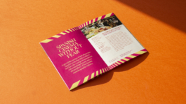
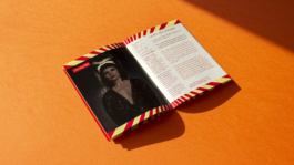
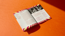
The gradient of the color palette is re-interpreted in the brochure in the form of a flip book. As passing each page, a new shade of the color palette appears. This enhances each of the colors used in this edition: pink, orange and red.

Creative direction and design: What The Studio
Campaign photography: Cecilia Díaz Betz
Light assistant: Arnau Rovira Vidal
Hands, nails and make up: Mariona Botella

Amsterdam Spanish Film Festival 2019
Following up with the flexible visual identity we created for the festival in 2018 – visualizing Spanish sunlight coming out from a cinema screen – we are introducing an update to the identity for this 5th edition of the festival: the 'Canela' typeface. The new typeface expresses the warmth and elegance of the festival, which has Pathé Tuschinski as a main venue. In an ambiguous space between serif and sans, it communicates the long standing tradition of Spanish cinema as well as the modernity of the carefully curated film selection of the festival.


The campaign image is a celebratory applause, and a humorous portrait of Spanish clichés. It also evokes the atmosphere of the cinema theatres during this 5th anniversary of the festival, while introducing one of the recurring themes in the films and side events of this edition: flamenco.

As in every new edition of the film festival, the city poster campaign is accompanied with a social media campaign which is strongly supported by the the festival's visual identity: the 'Canela' typeface in combination with the flexible visual system that allows create a sense of newness for each publication – combining different stroke widths with different color gradient shades every time.


The gradient of the color palette is re-interpreted in the brochure in the form of a flip book. As passing each page, a new shade of the color palette appears. This enhances each of the colors used in this edition: pink, orange and red.


Creative direction and design: What The Studio
Campaign photography: Cecilia Díaz Betz
Light assistant: Arnau Rovira Vidal
Hands, nails and make up: Mariona Botella
Wouldn't it be nice to work together?
Talk to us: hello@what-the.studio
CONTACT
hello@what-the.studio
+31 646425297
Hey, visitor!
We are What The Studio, an independent graphic design & creative direction studio in Amsterdam.