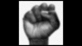
visual identity, website, campaigns
Veem House for Performance
Veem House for Performance is a theatre and production house in Amsterdam, oriented to international audiences and artists who are given the space to experiment, develop and present their work. Next to the performances by up and coming artists, Veem's program includes their own discursive 'house' events.
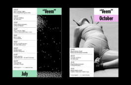
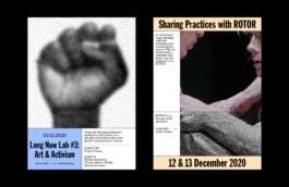
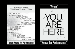
In restyling Veem's visual identity, we kept the original logo typeface and an overall feeling of lightness and dryness. From here, we pulled from two central aspects that define Veem: movement and experimentation.
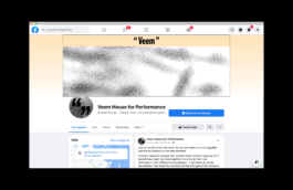
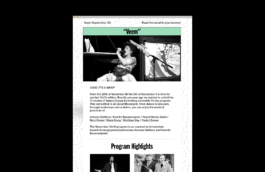
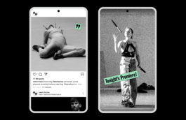
While the visual identity system uses a flexible (and visible) grid to organise content, these contents freely jump out of this grid every now and then. In order to pin freedom and motion as intrinsic parts of the identity, we gave images an 'extreme pixel treatment', into which we zoom in and out. When zoomed out, photographs are detailed and comprehensive while, when zoomed in, these become abstract and random patterns that visualize the flows of movement.
'Movement' is represented not only as physical motion, but also in the sense of activism, related as well to Veem's discourse. Hence, the black and white low-res image treatments add a DIY layer to the visual identity, which plays well with the more underground works presented at Veem.
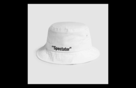
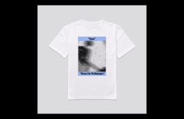
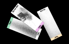
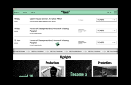
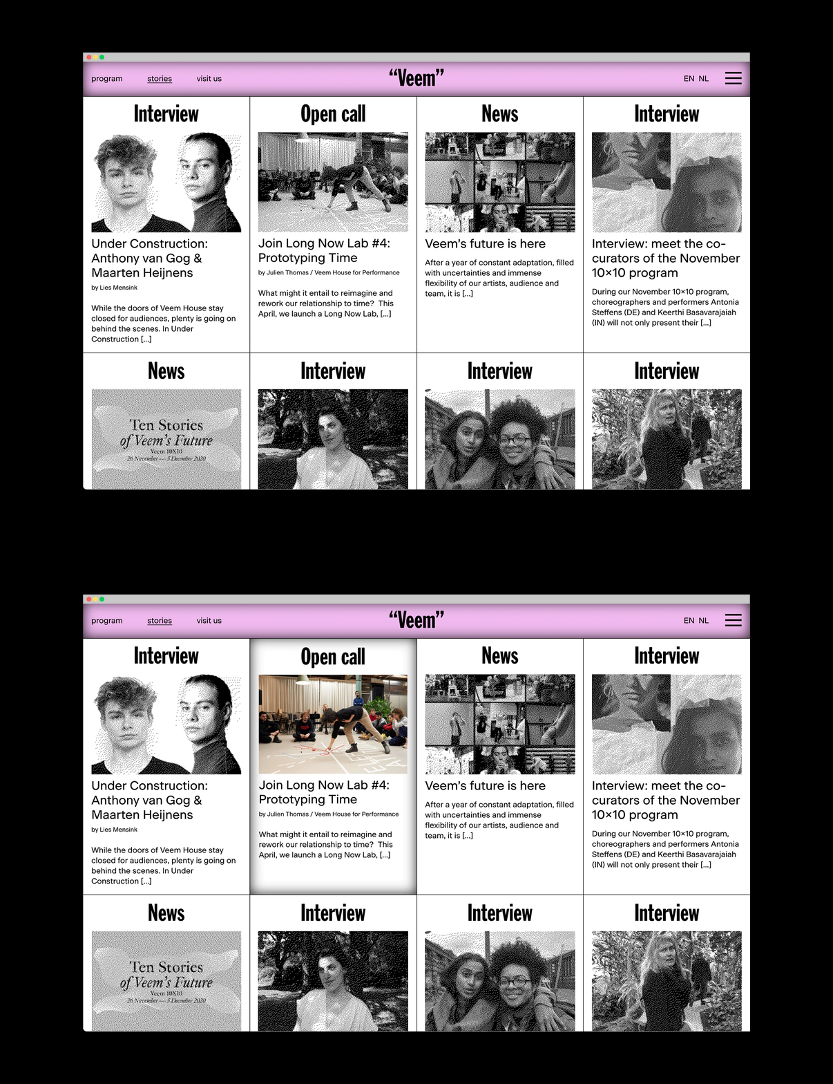
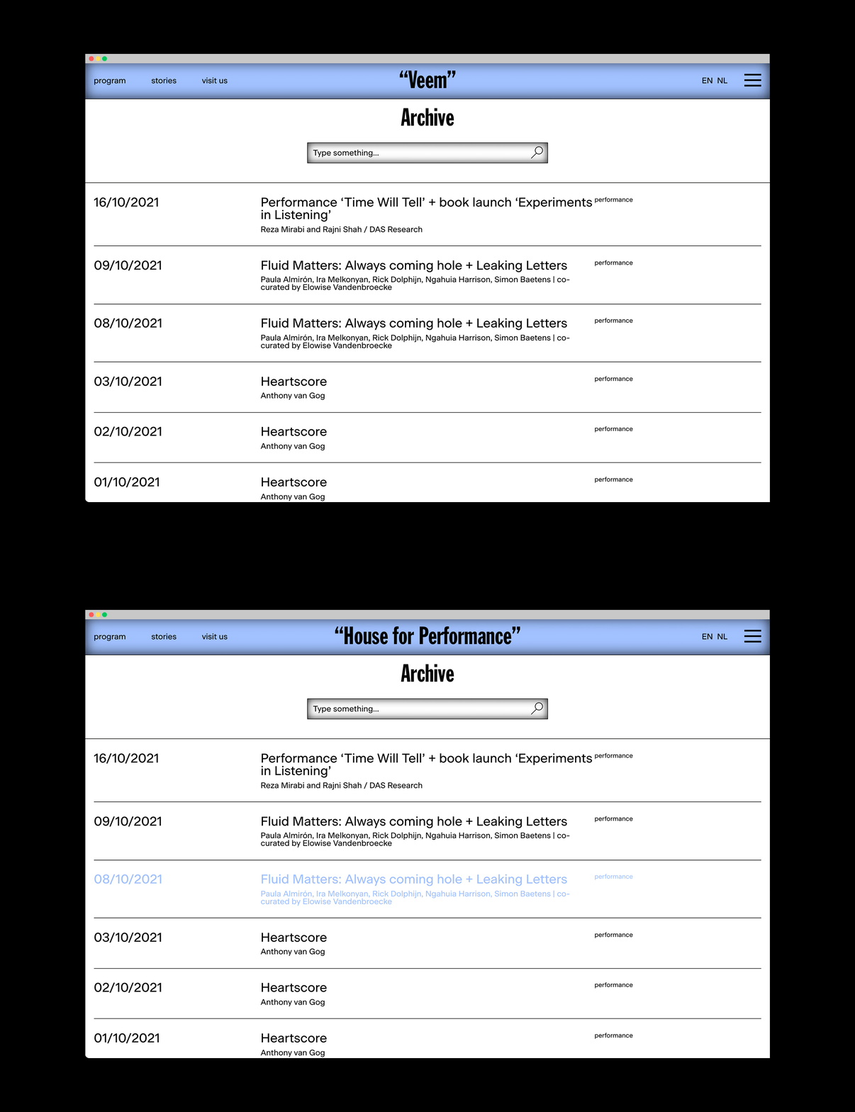
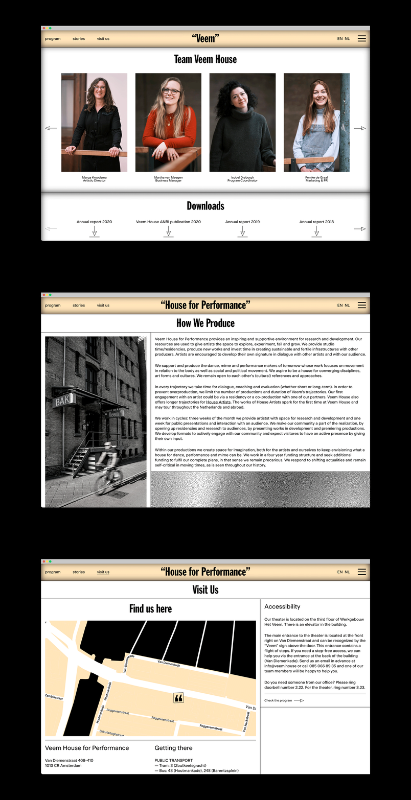
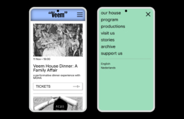
The elements that conform the visual identity are put into practice in diverse printed and digital communication materials such as posters, social media contents or in Veem's website.
Concept, design and creative direction: What The Studio
Web development: Floris Douma

Veem House for Performance
Veem House for Performance is a theatre and production house in Amsterdam, oriented to international audiences and artists who are given the space to experiment, develop and present their work. Next to the performances by up and coming artists, Veem's program includes their own discursive 'house' events.


In restyling Veem's visual identity, we kept the original logo typeface and an overall feeling of lightness and dryness. From here, we pulled from two central aspects that define Veem: movement and experimentation.
While the visual identity system uses a flexible (and visible) grid to organise content, these contents freely jump out of this grid every now and then. In order to pin freedom and motion as intrinsic parts of the identity, we gave images an 'extreme pixel treatment', into which we zoom in and out. When zoomed out, photographs are detailed and comprehensive while, when zoomed in, these become abstract and random patterns that visualize the flows of movement.
'Movement' is represented not only as physical motion, but also in the sense of activism, related as well to Veem's discourse. Hence, the black and white low-res image treatments add a DIY layer to the visual identity, which plays well with the more underground works presented at Veem.


The elements that conform the visual identity are put into practice in diverse printed and digital communication materials such as posters, social media contents or in Veem's website.


Concept, design and creative direction: What The Studio
Web development: Floris Douma
Wouldn't it be nice to work together?
Talk to us: hello@what-the.studio
CONTACT
hello@what-the.studio
+31 646425297
Hey, visitor!
We are What The Studio, an independent graphic design & creative direction studio in Amsterdam.